Getting the portfolio in shape.

With a diverse range of shapes and flavors topitos had a fragmented look to the brand. We created an abstract identity that was reflective of its’ many shapes and forms and added dimensional food photography to better define the taste experience. Photography by John Worthen.

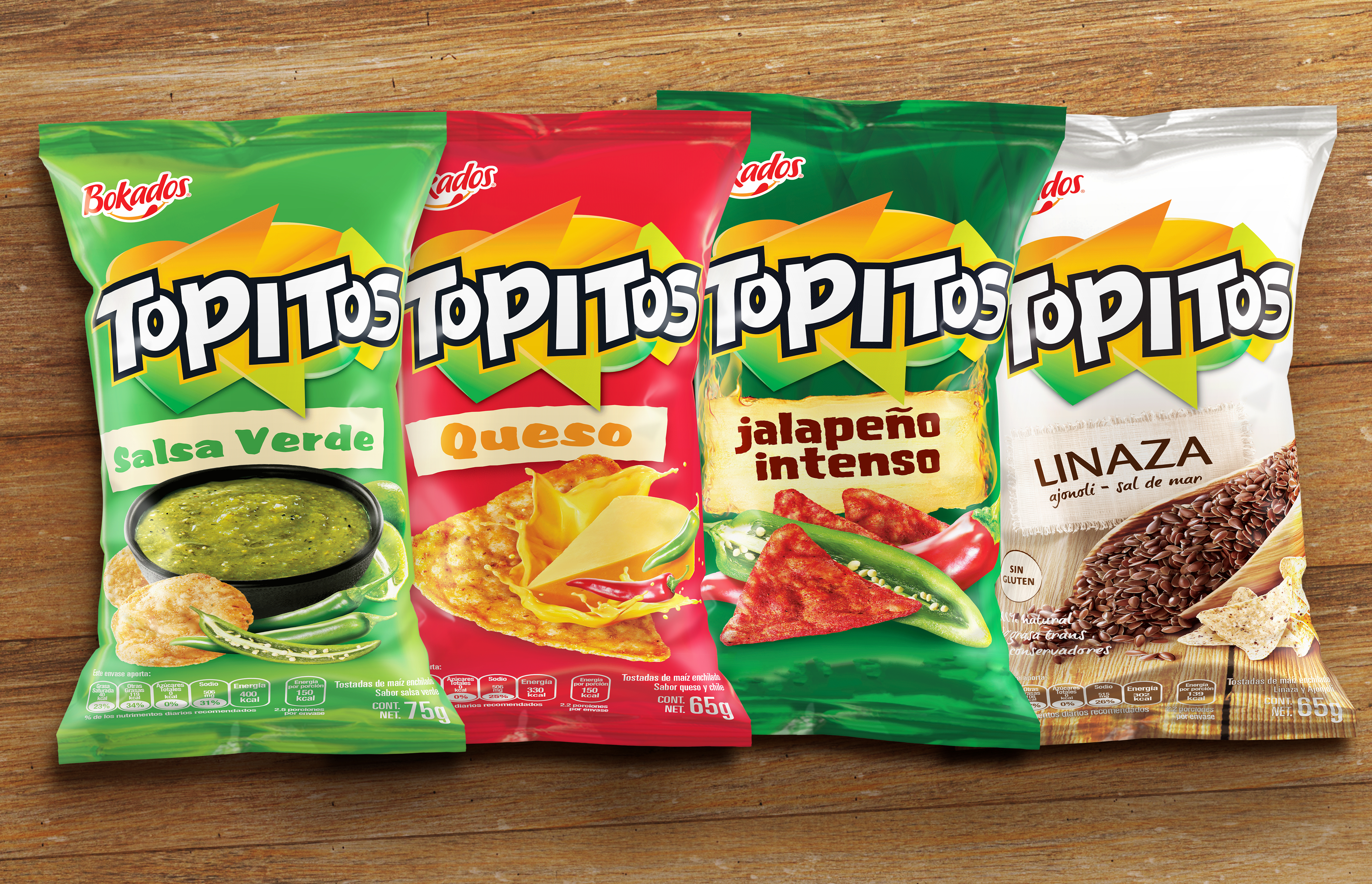
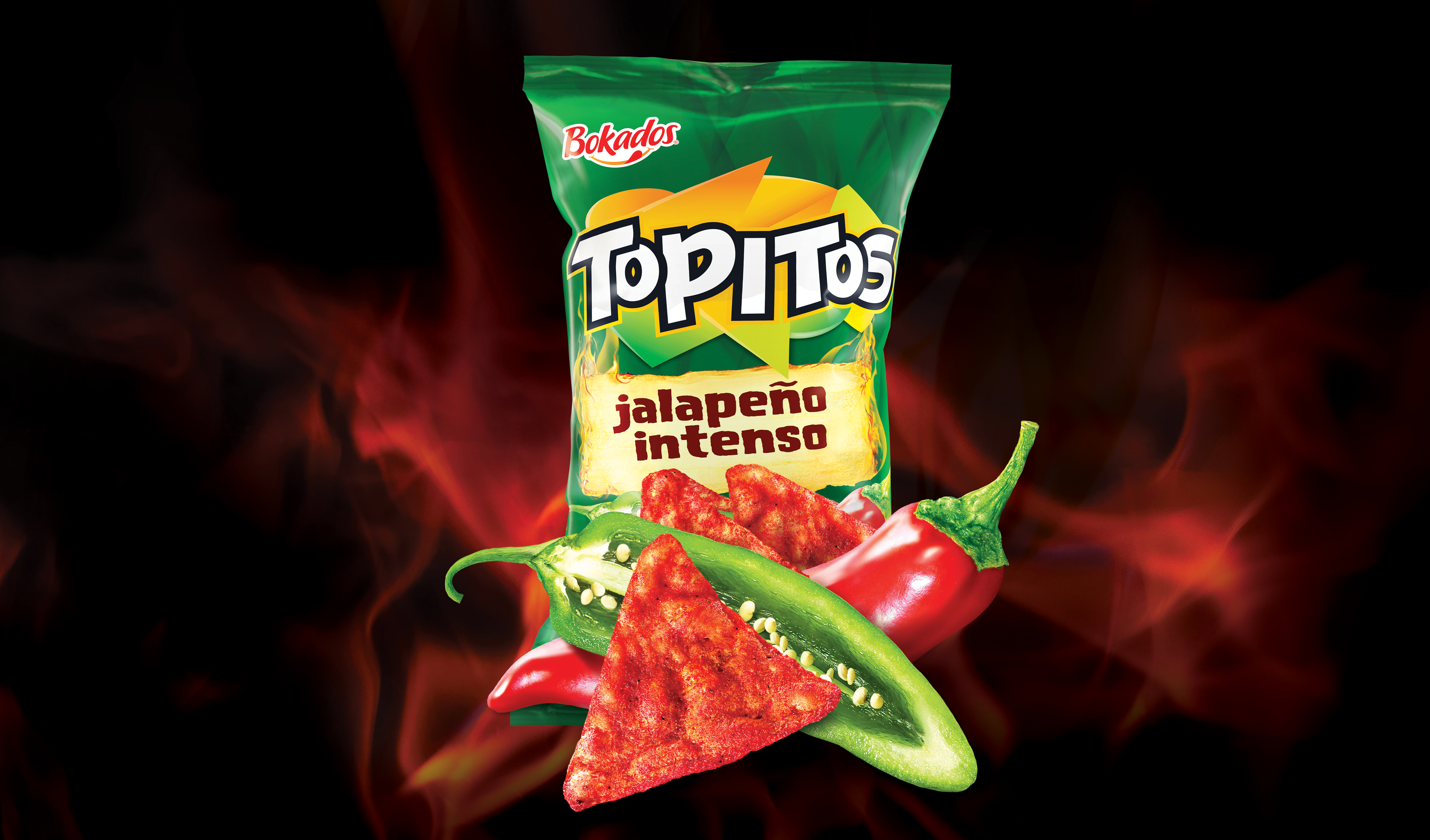
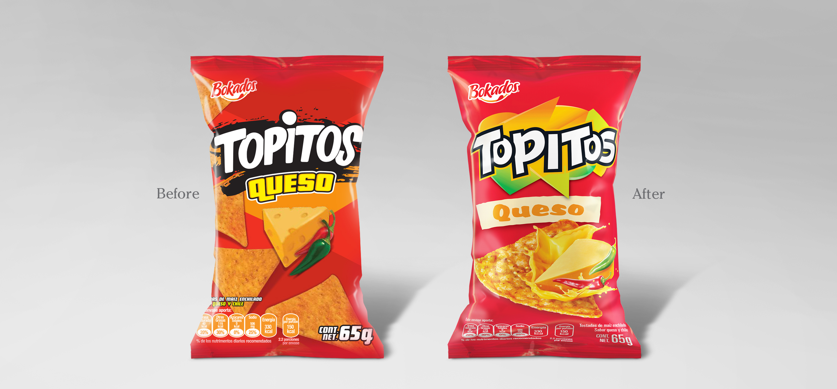
As always we start from a pure conceptual – in this case the idea of abstraction as a means to deliver the complex portfolio message was chosen, each shape could be woven into each other, dimensionalizing the brand’s story and making its’ purpose clearer to consumers.

Related Work