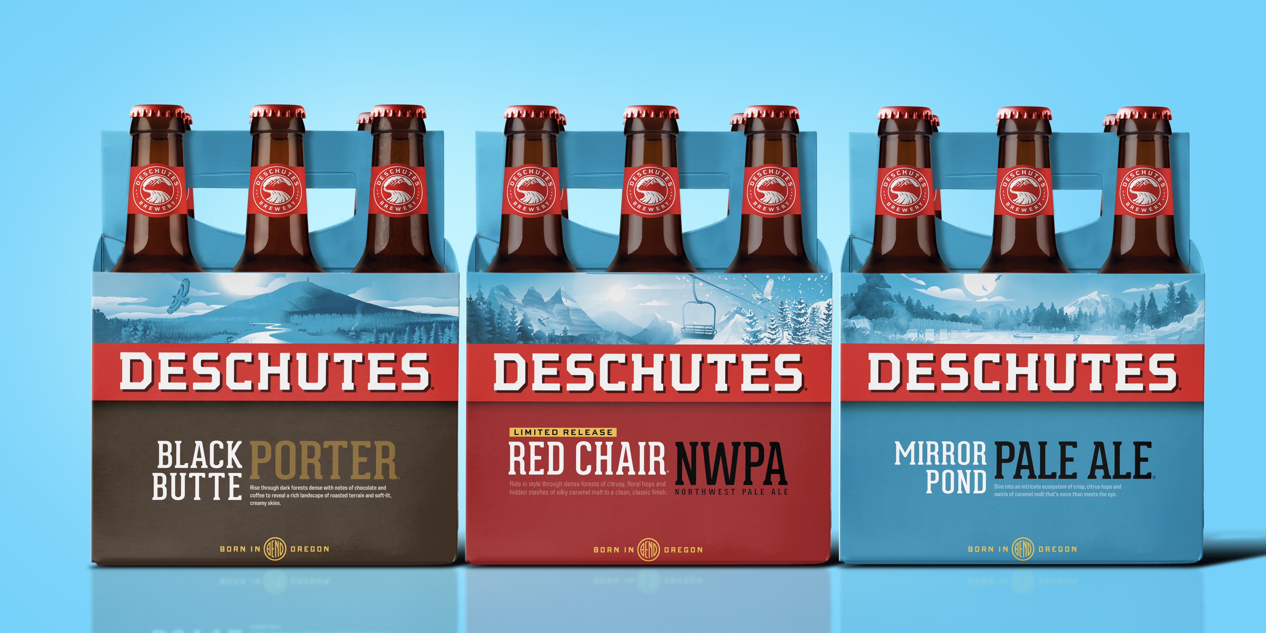
Crafting simplicity and clarity.
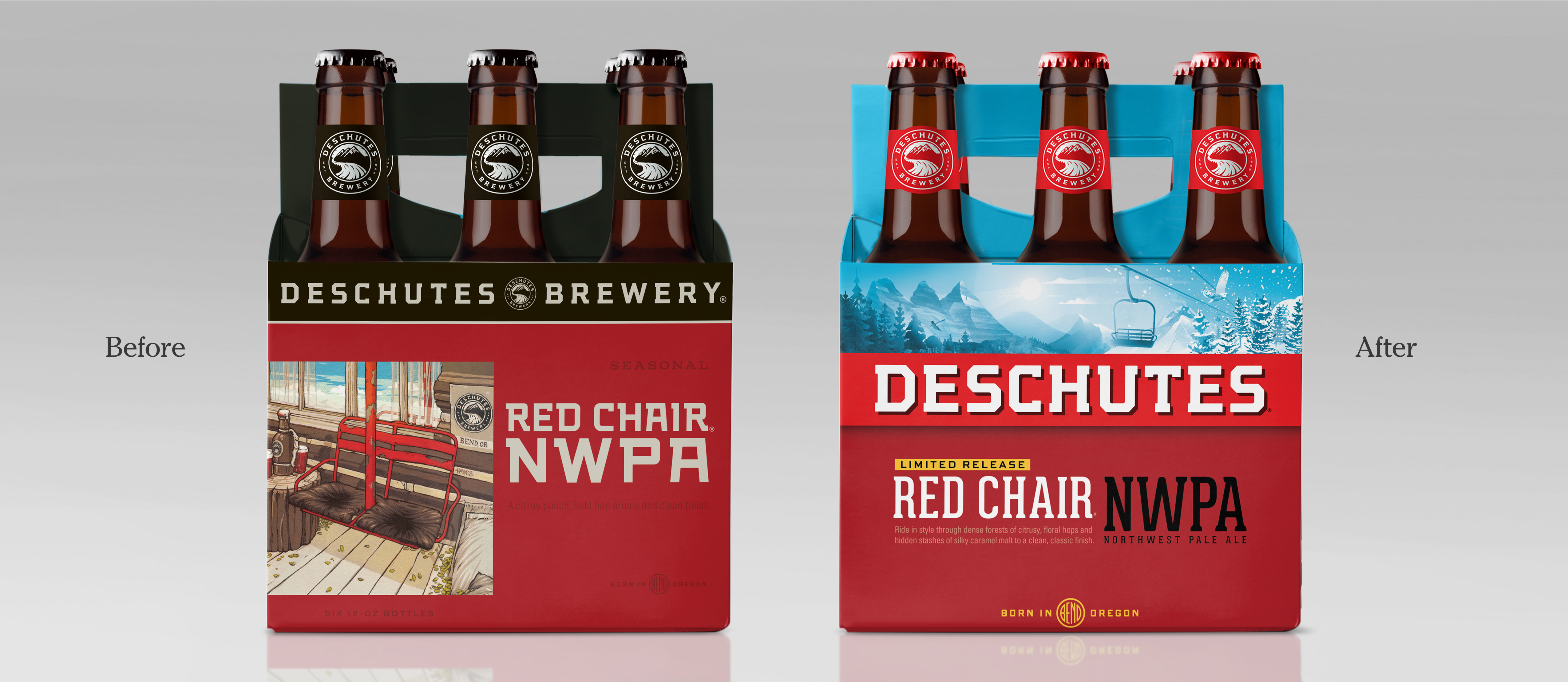
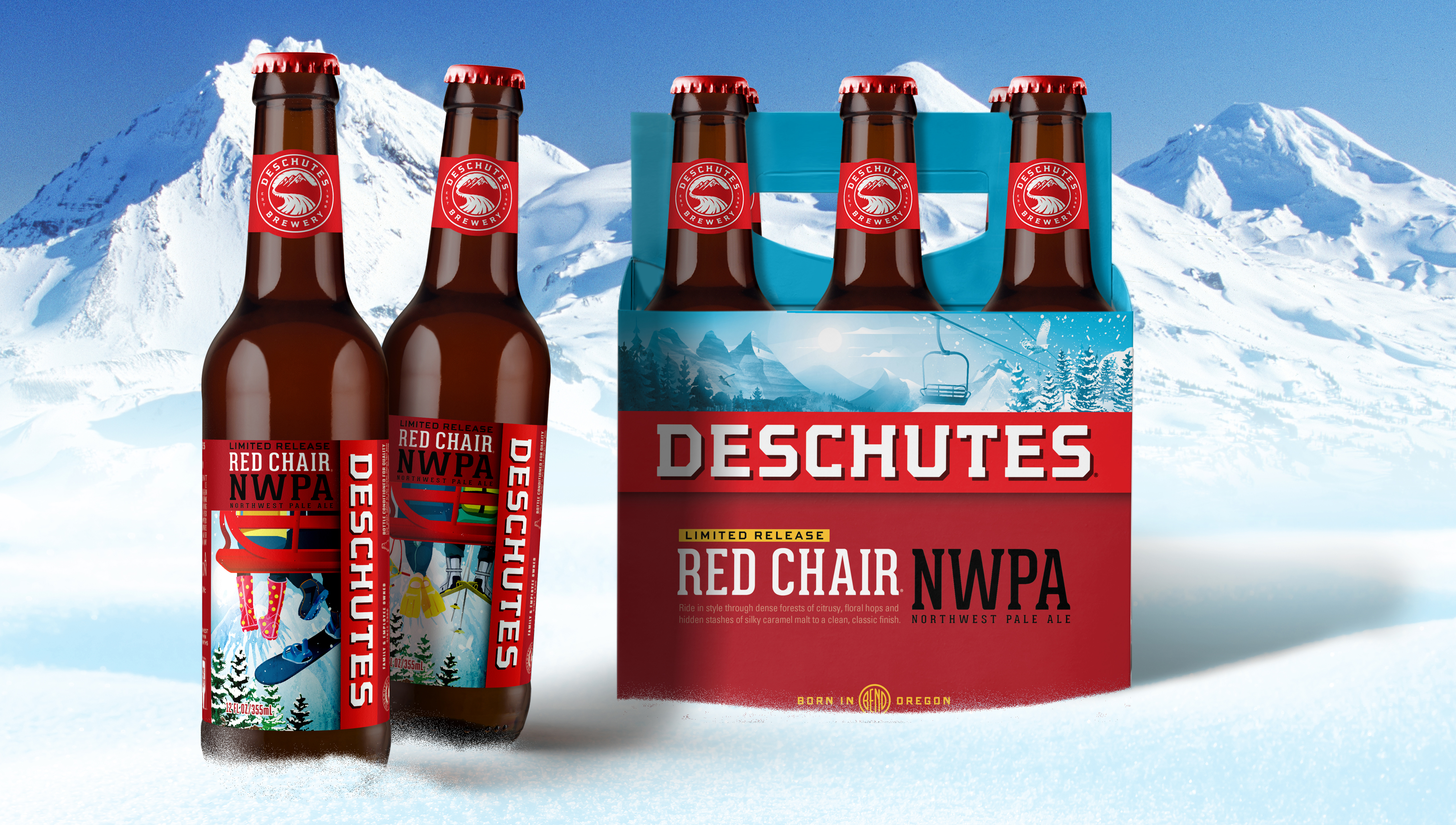
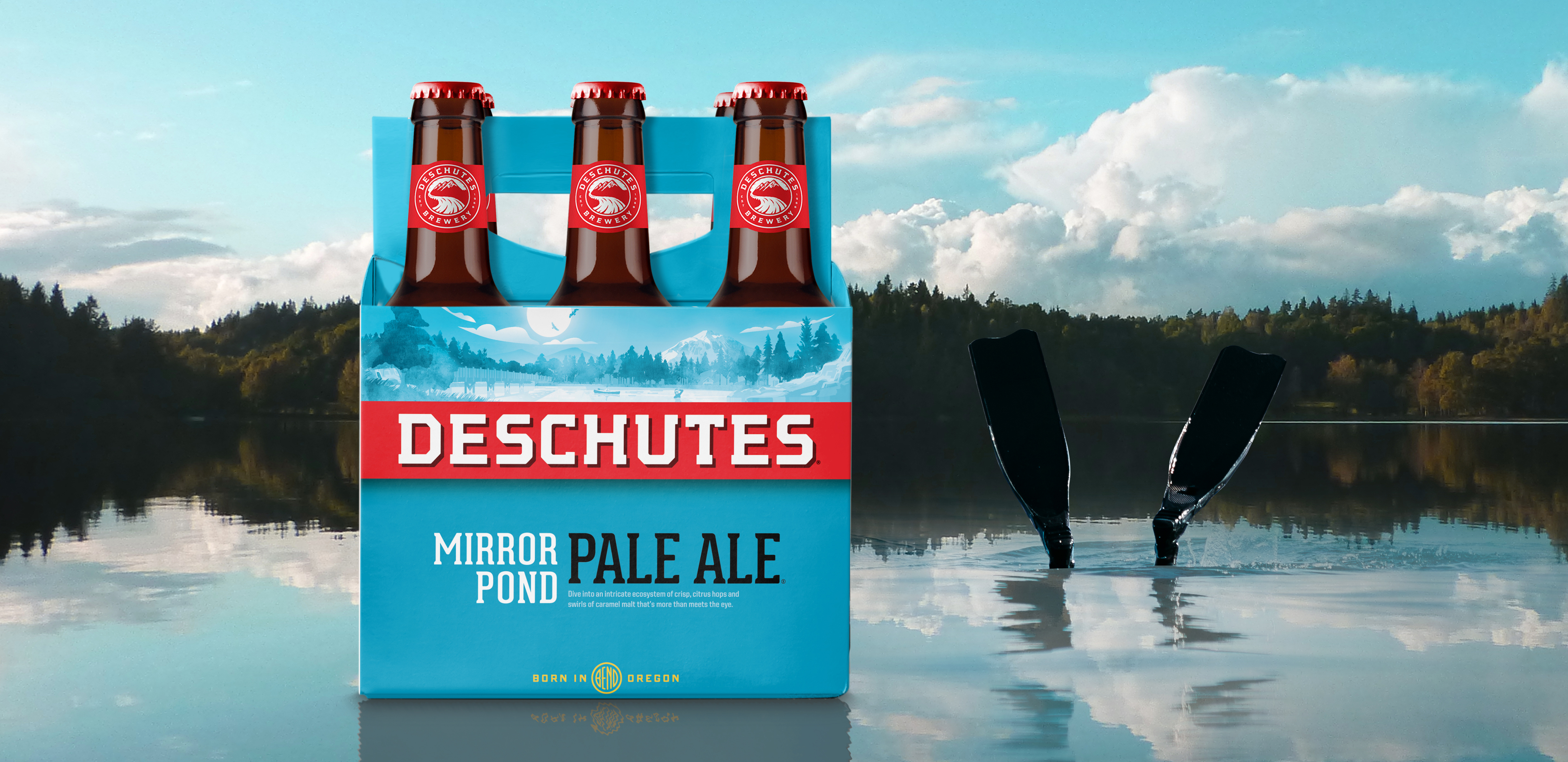
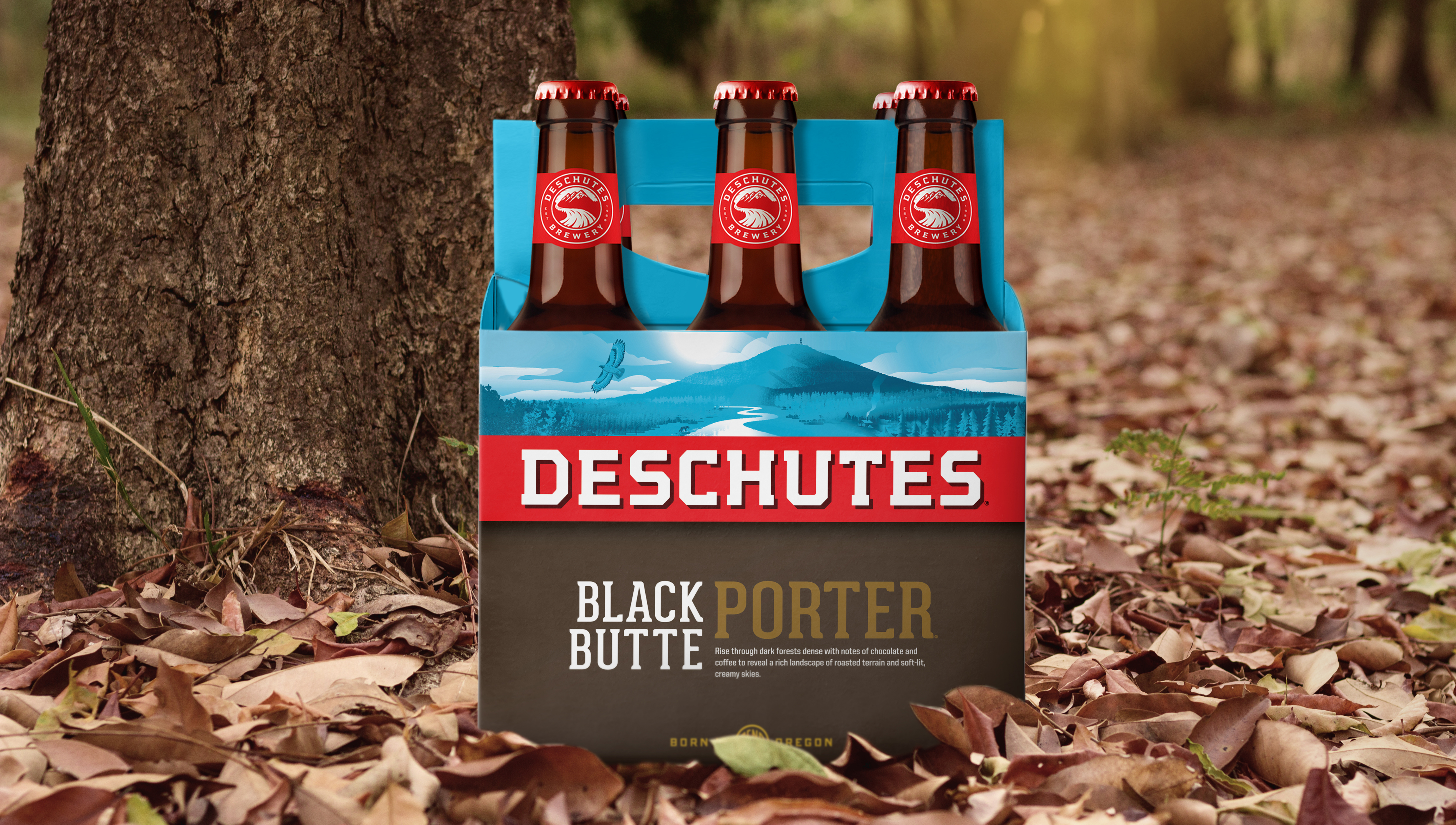
Craft beer is awash in quirky, whimsical branding – a cluttered, crowded category with far too many brands looking the same by trying so hard to look different. We saw an opportunity to create much-needed clarity by returning Deschutes Brewery to its roots with a design that boldly presents the iconic brand and its beer styles with powerful, refreshing simplicity.
