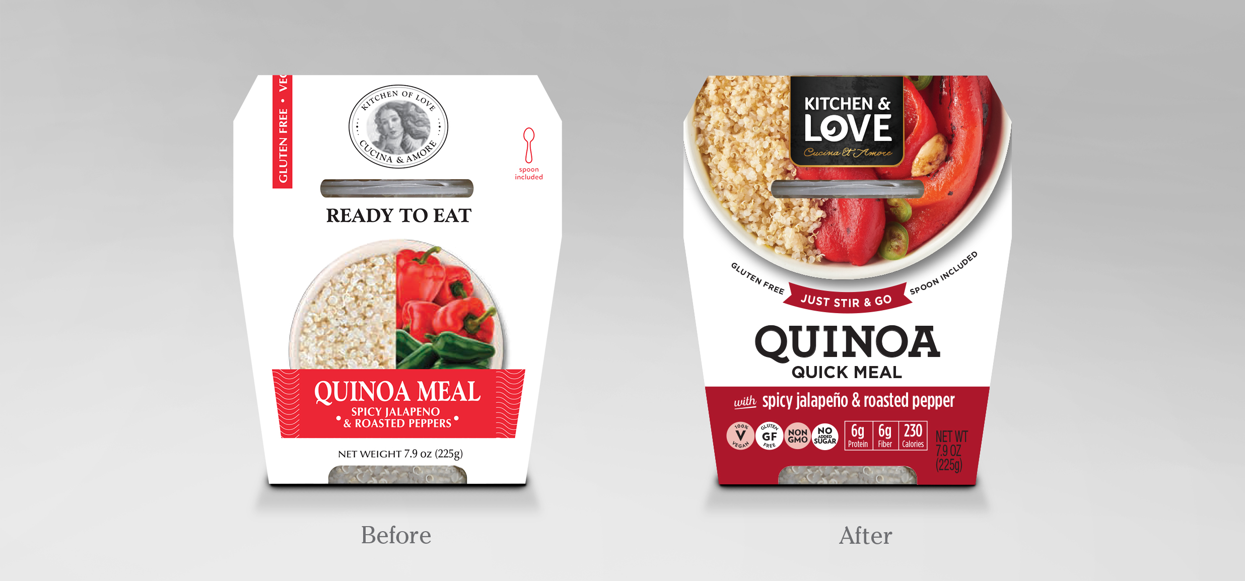
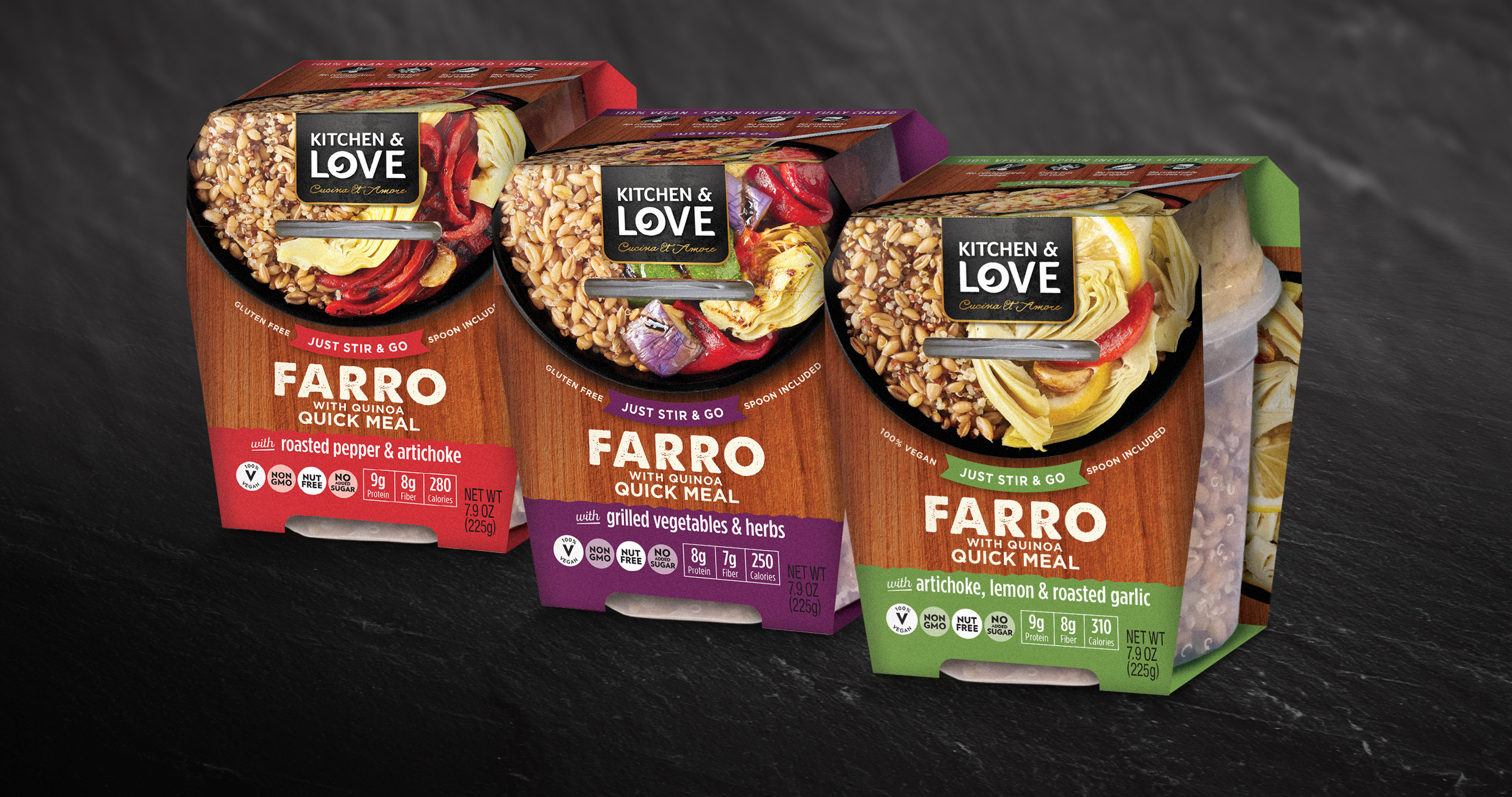
Giving the packaging some love.

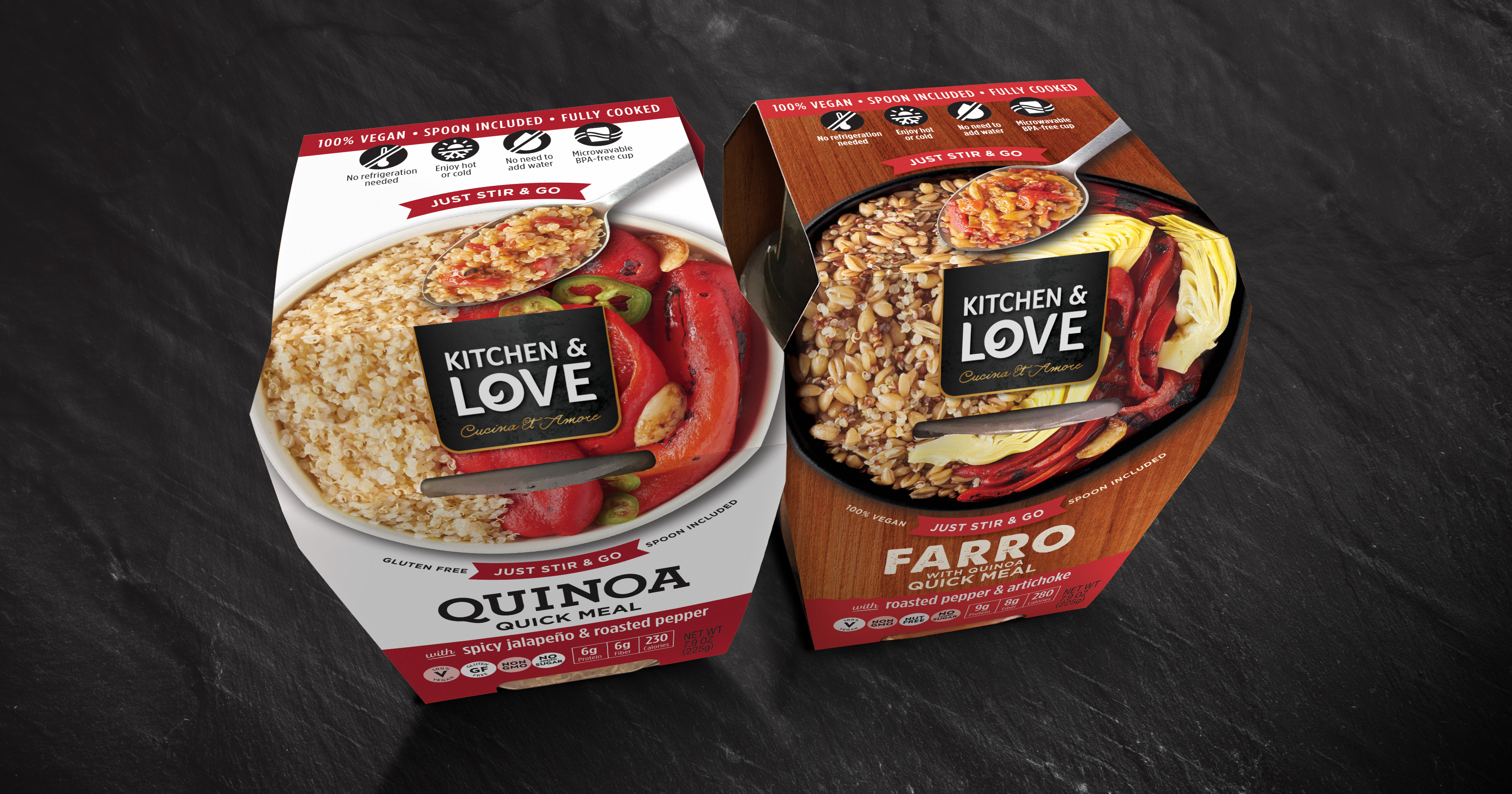
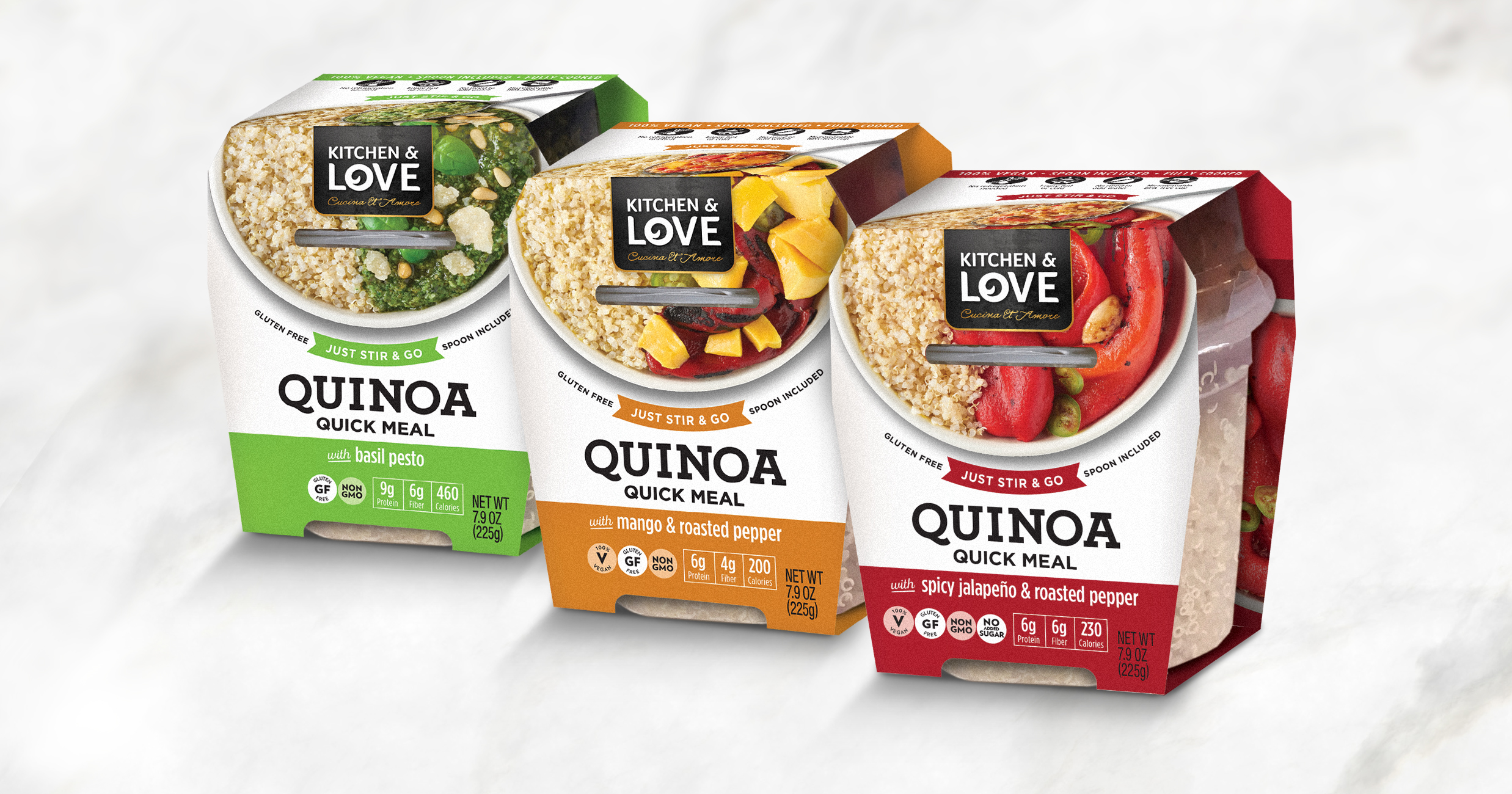
Building a strong architecture that put the delicious food at the center of the story was key to the design refresh. Updated language and visuals making it very easy for the consumer to understand the convenience of the product and clear identification of health claims make it stand out at shelf.

Creating a meaningful identity.

We created a slight optical illusion as the food photography continues onto the top of the pack and the angle of the spoon makes you feel as if you can dip right into the pack. Simple icons help guide the consumer to how to best enjoy the product. Photography: Noel Barnhurst (noelbarnhurst.com)

Related Work