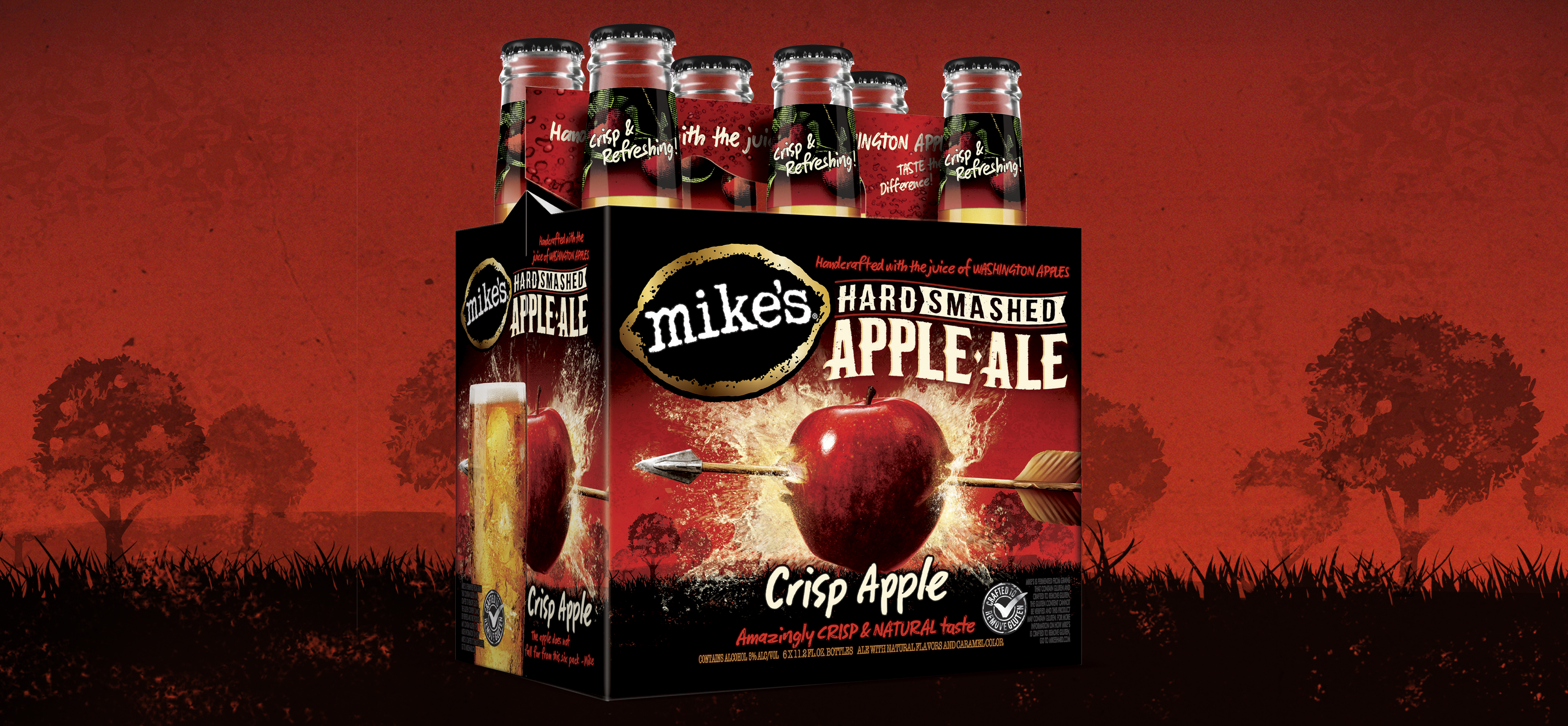
Making Hard look easy.
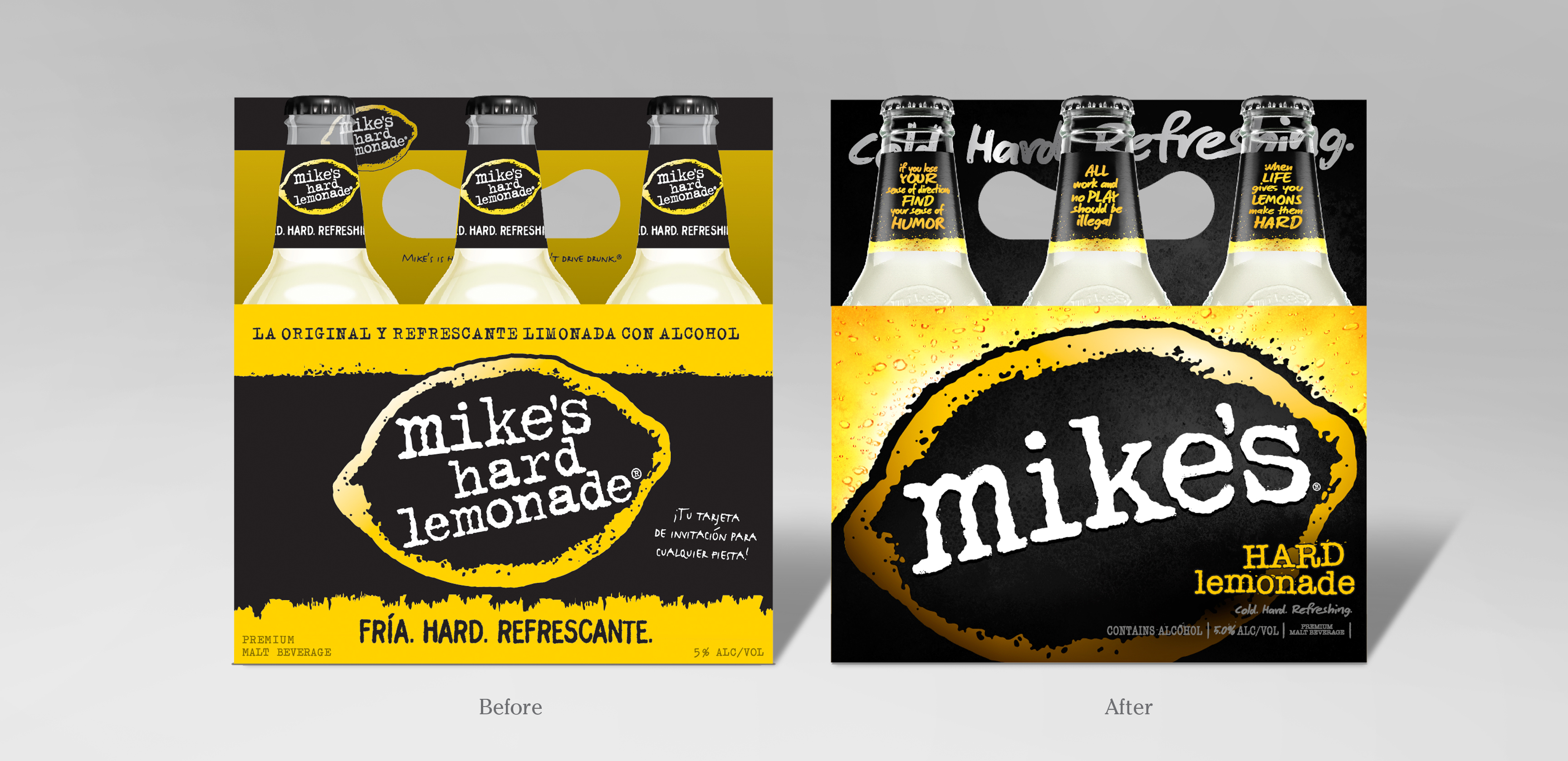
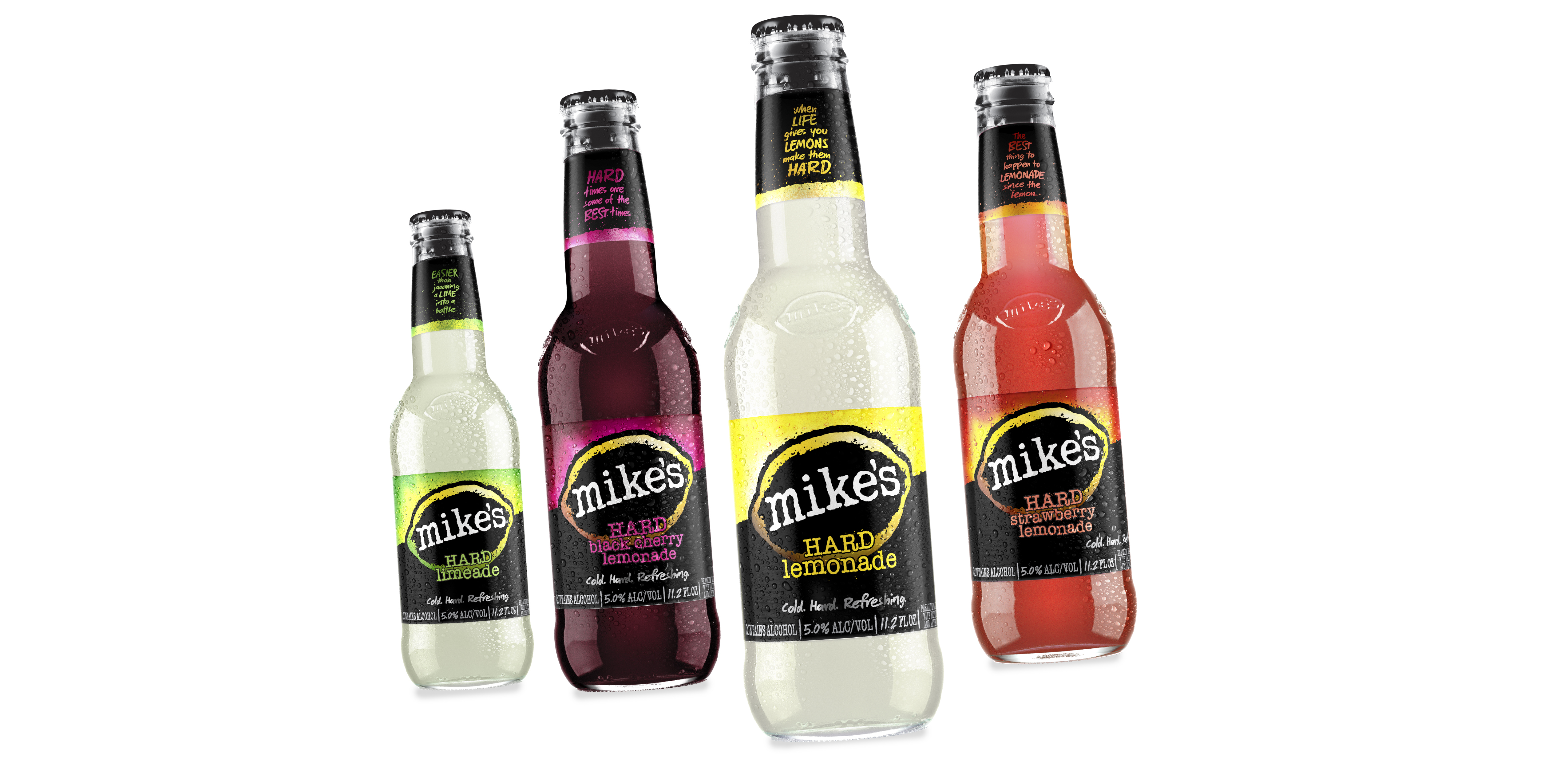
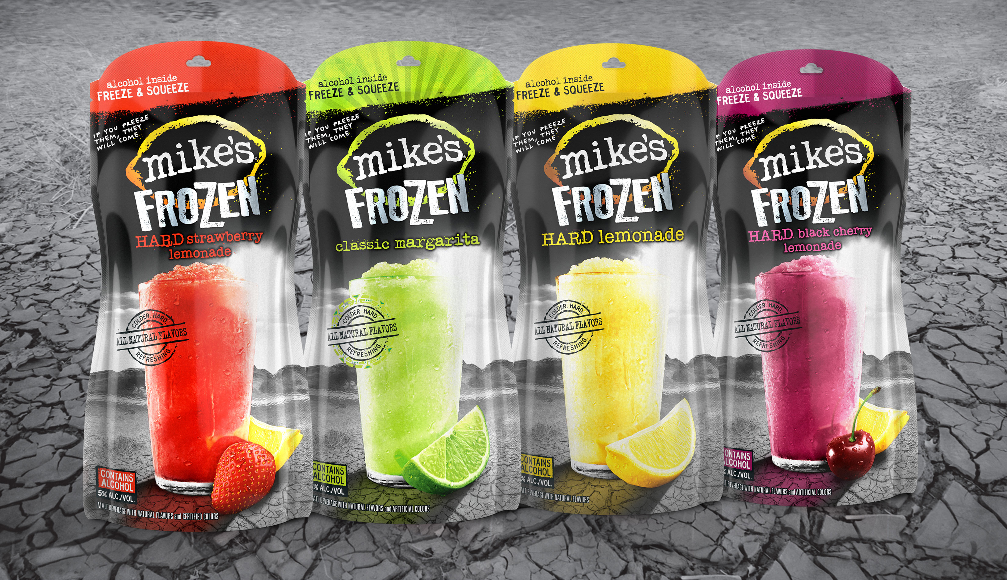
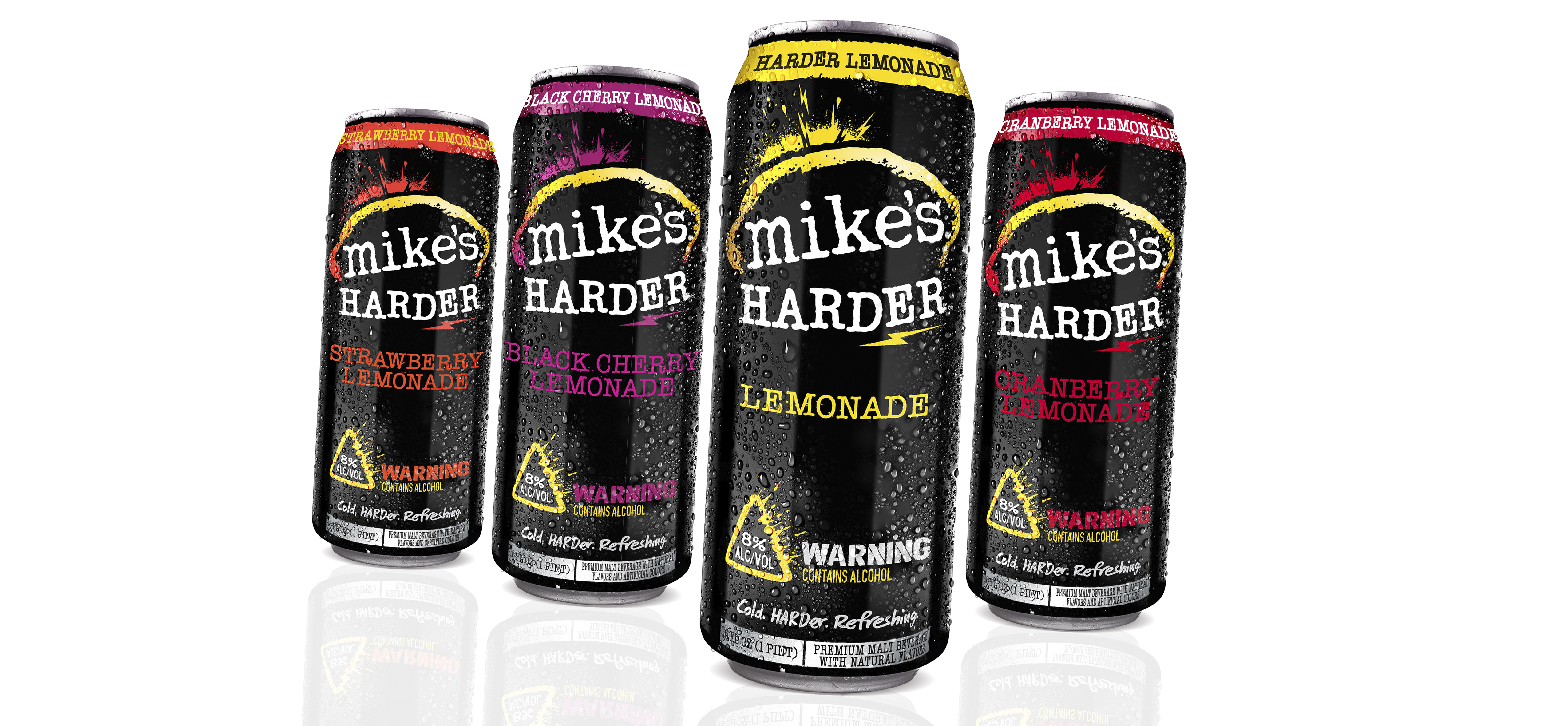
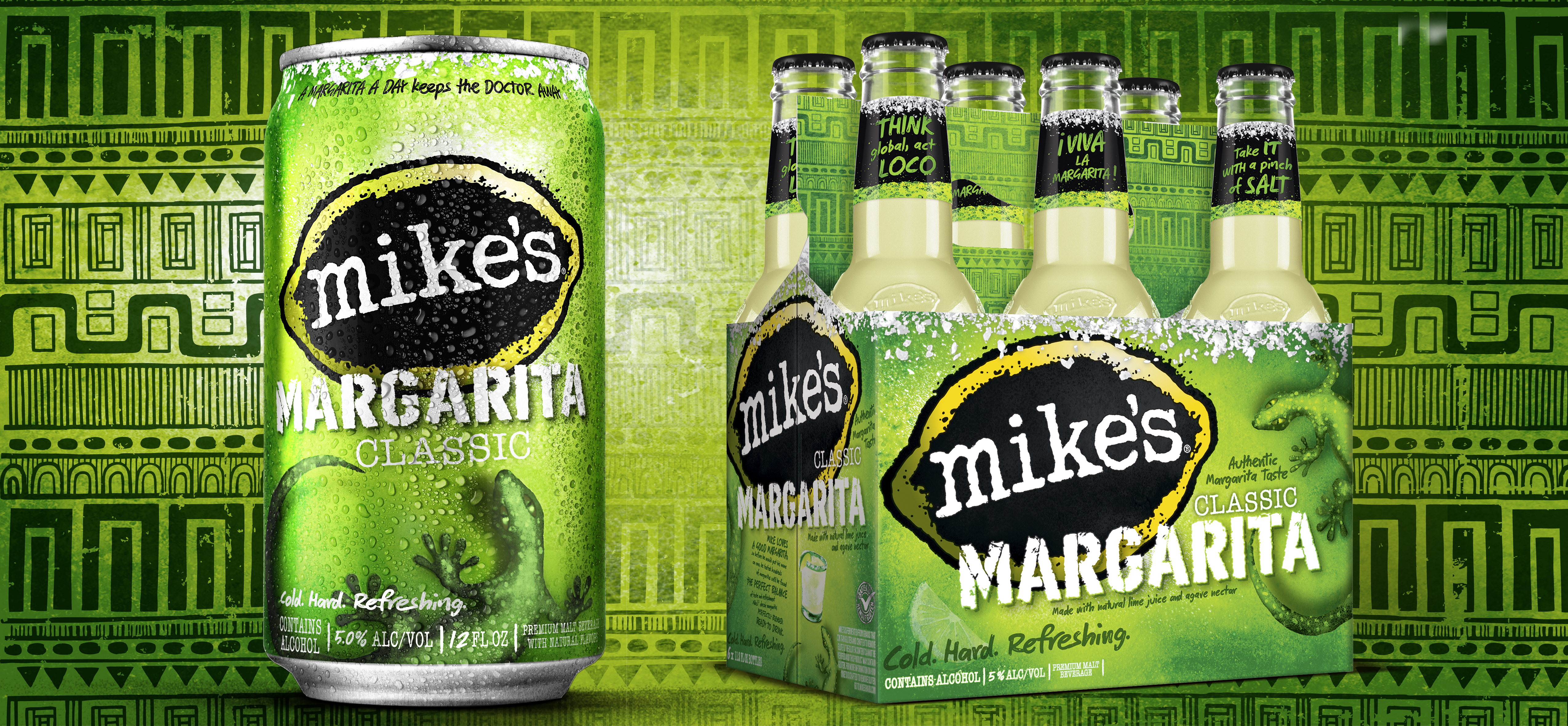
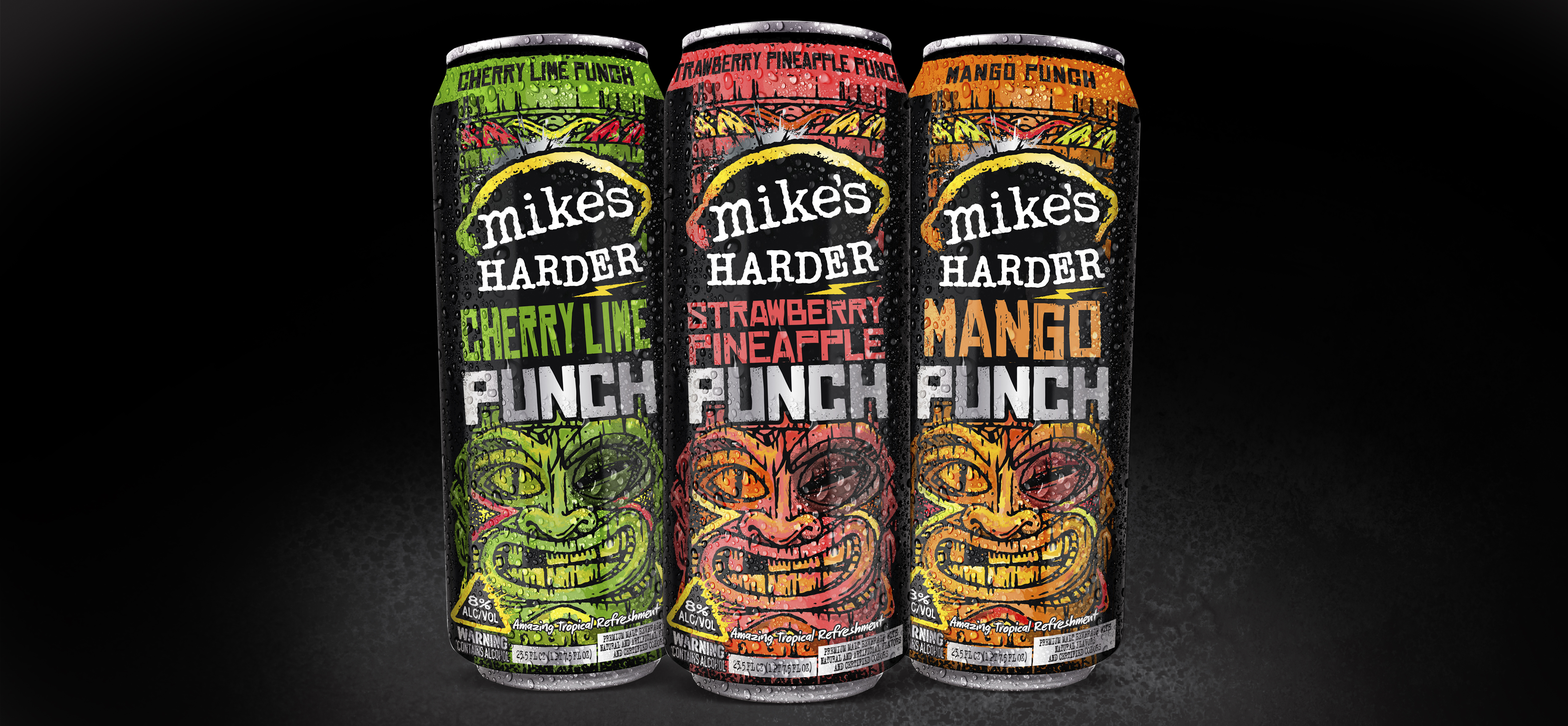
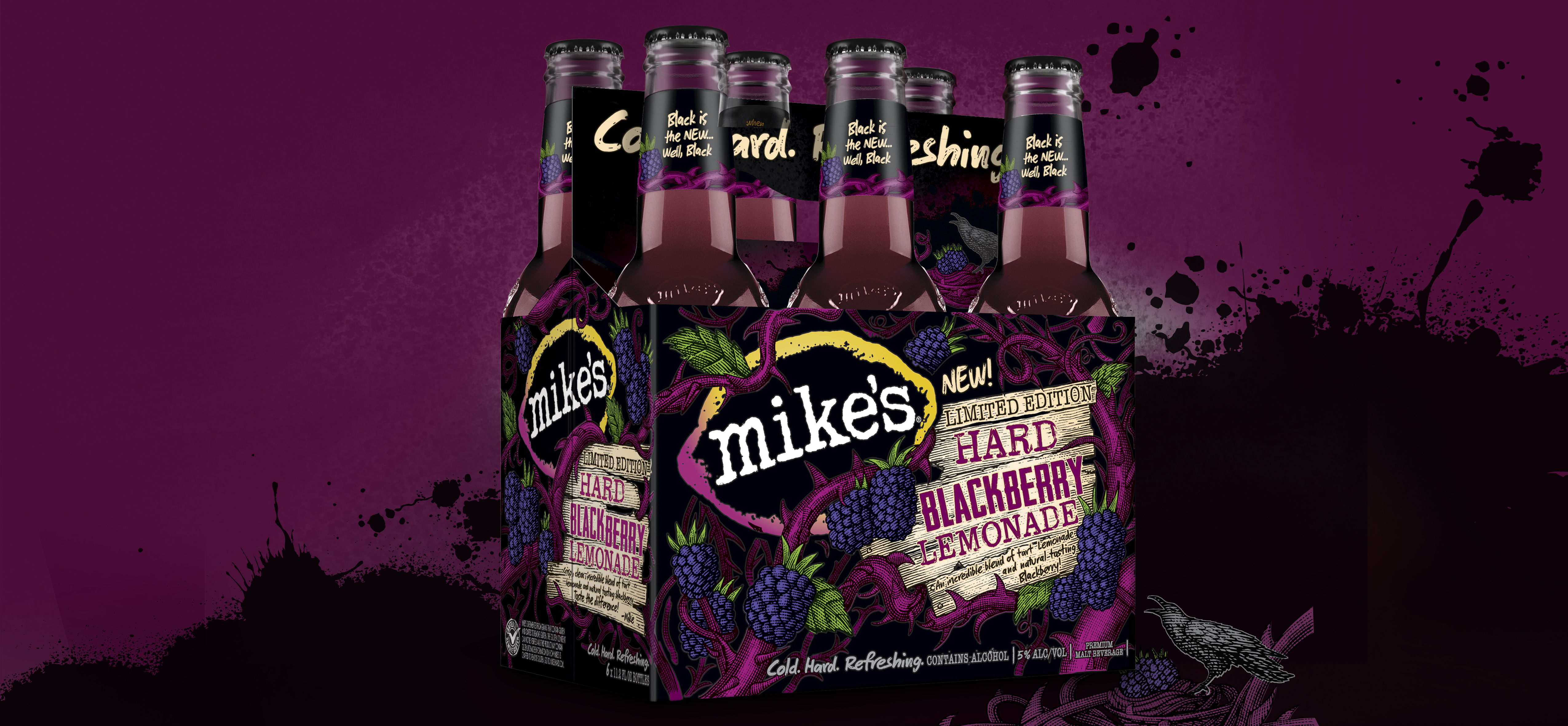
Once such a breakthrough design, Mike’s needed to re-establish its brand presence and created an identity and architecture that would allow for the amazing variety of products that were launching. A bold, striking brand identity and refreshing feeling packaging re-forced the quality of the liquid.
